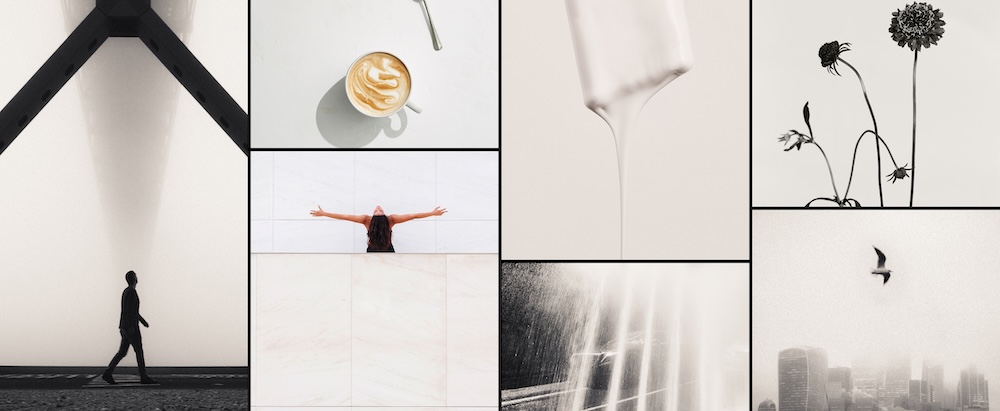
Cloud Dancer, Pantone’s 2026 Color of the Year, suggests that what we need most is a moment of serenity.
While it’s calming to consider, it doesn’t align with where design culture is actually headed.
Whether it’s a major campaign, runway color stories, or visual research from this year’s Design Trend Report, every signal points toward the opposite.
After several years of uniform palettes and soft neutrals, people are craving saturation, richness, and visual presence.
Color in 2026 is emotional, confident, and carries a point of view.
Cloud Dancer may soothe the collective nervous system, but the market is responding to colors that provoke curiosity and demand attention. Audiences want more than a slightly calming presence.
Give them something with taste, personality, and a little momentum.
RELATED READS: Color Choice is Essential for Good Visual Storytelling—Here’s Why
After a spirited discussion with our in-house creative team, we’ve put together three colors that better represent the year ahead. Not in opposition to Pantone’s selection (in fact, all three pair exceptionally well with it), but as a reminder that the future isn’t monochrome. And color needs to say something.
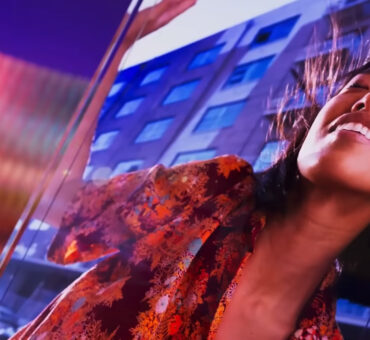
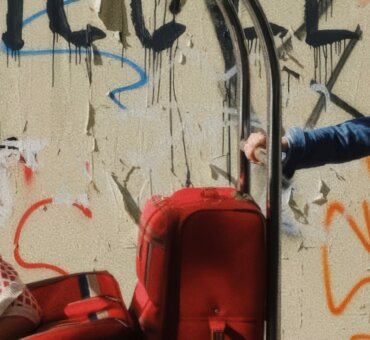
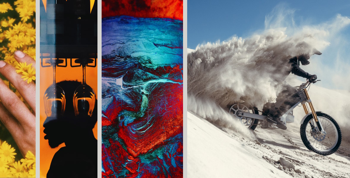
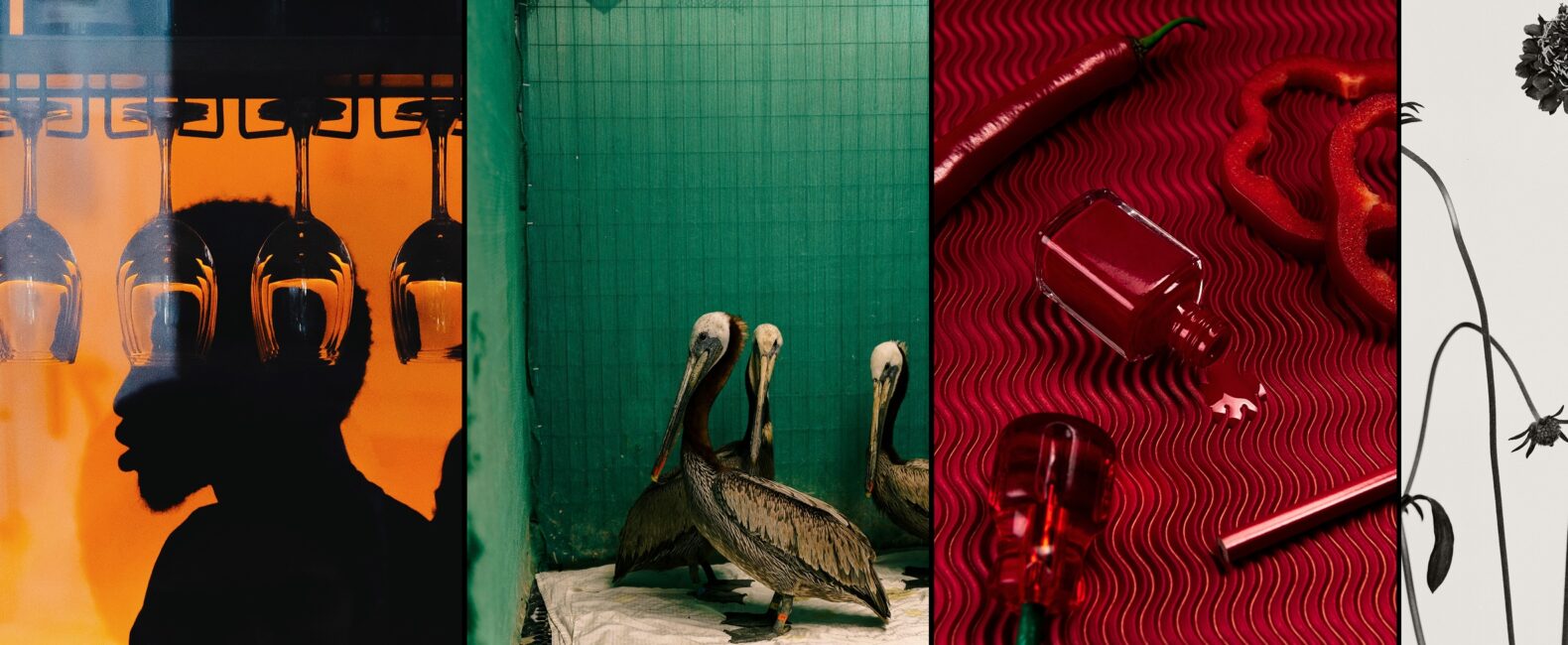
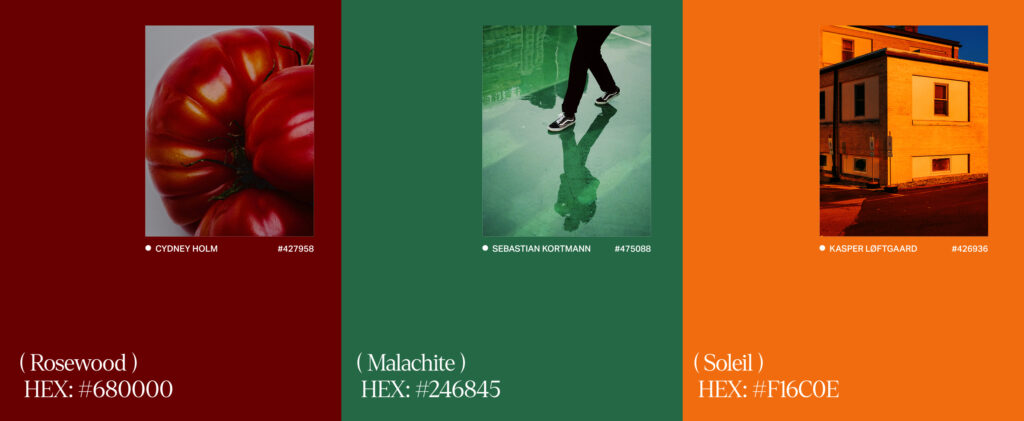
Rosewood
Red is returning with force, especially in sports marketing, fashion, and identity work. There’s a reason for that. It cuts through and speaks to something primal.
The eye can’t ignore it.
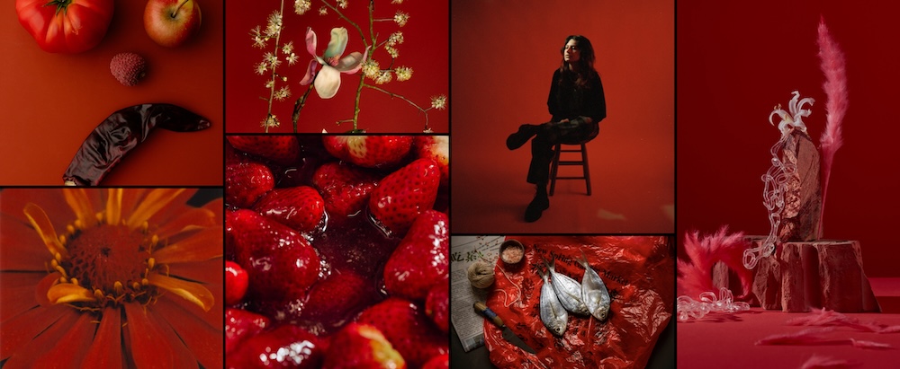
But what’s interesting now isn’t the bright primary red of logos past; it’s the deeper, high-saturation range of colors like rosewood. The darker the value, the more dimensional the story becomes.
These reds create mood, tension, and tonal richness, something ideal for designers who want color to act as narrative, not solely accent. “I want more red. And 2026… that just feels like a red number,” says art director Jason Murray.
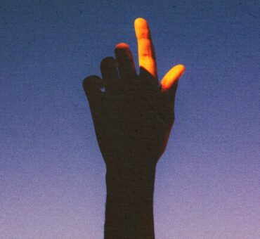
Soleil
Orange has long existed at the edges of taste culture: beloved in the ‘70s, resurfacing in the late ’90s/early ’00s, and now fully ready for its cultural comeback.
RELATED READS: The Revival of Vintage in Modern Graphic Design
Soleil is inherently playful, as it leans brighter, but shifts toward warmth and maturity when deepened.
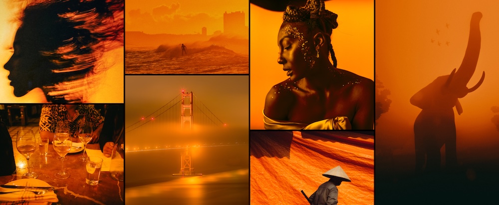
Paired with blue, the contrast is electric. It’s optimistic without being naïve, confident without being loud for the sake of being loud.
Malachite
Green never leaves the conversation, and this year it gets cooler, sliding closer to blue with malachite.
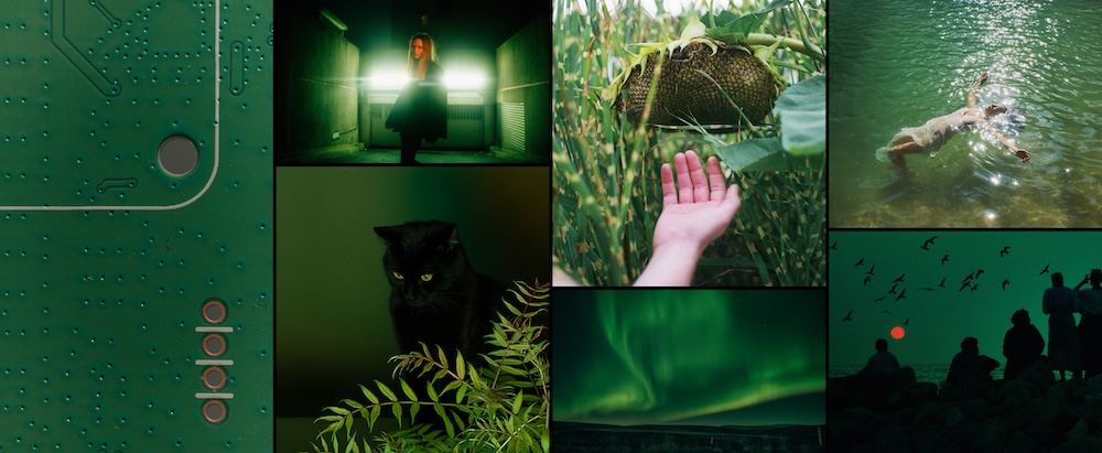
There’s something regal and composed about this tone, yet fundamentally approachable because of its relationship to the natural world. It simply exists, feels right, and serves as a reminder that taste doesn’t always require novelty; sometimes it’s about returning to something timeless.
“Green is timeless,” says Murray. “We’ve definitely seen an influx. But when trends move on, I don’t think we’ll ever get tired of it.”
The Bigger Shift
If there’s a common thread connecting these three colors, it’s nature.
After a decade dominated by tech minimalism, hyper-polished white, and millennial gray, the pendulum is moving toward saturation, texture, and sensory richness.
Cloud Dancer has a role to play, but it’s not a protagonist. It’s a supporting color, a stabilizer, the space between ideas.
Whether you co-sign this year’s Pantone pick or not, 2026 isn’t the year for timid palettes and disappearing into the background.
Color needs to commit.
When you select color with intention, you show up with presence and a point of view. So choose something that carries personality, depth, and direction.