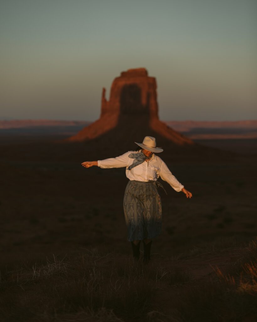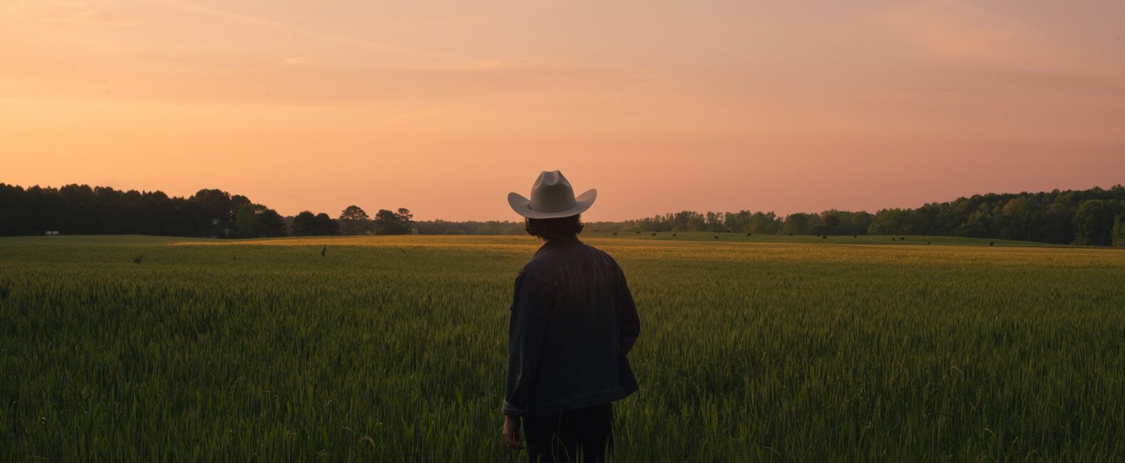
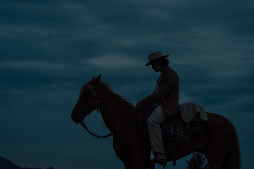
There’s something magnetic about imagery that captures the toughness, quiet resilience, and raw texture of the American West.
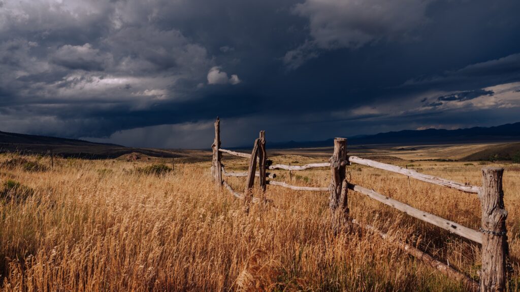
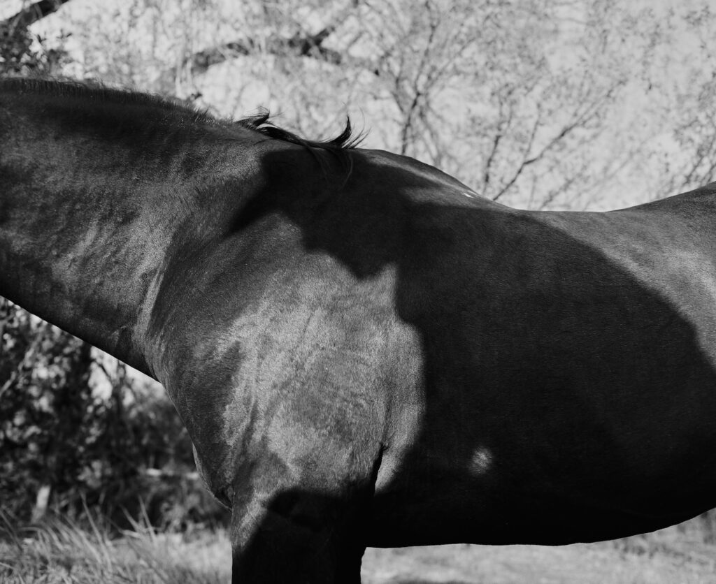
It doesn’t need to shout to hold your attention. The power of Americana often comes from its restraint—the stillness of a sunburned landscape, the worn leather of a saddle, the dust caught in late-afternoon light, the steady posture of someone shaped by work, weather, and place.
These images carry a story before a single word is added.
That’s what makes Americana one of the most story-forward imagery trends defining design right now. It gives creatives a visual language rooted in character, history, and lived experience—one that feels culturally resonant without feeling overly polished or manufactured.
RELATED READS: Candid Imagery in Design: Capturing Authenticity in a Polished World
Why Americana Is Resonating Now
Audiences are tired of visuals that feel frictionless, filtered, and interchangeable. They’re drawn to work that feels specific. Human. Lived-in. Americana answers that need with a visual world full of texture, imperfection, and emotional weight.
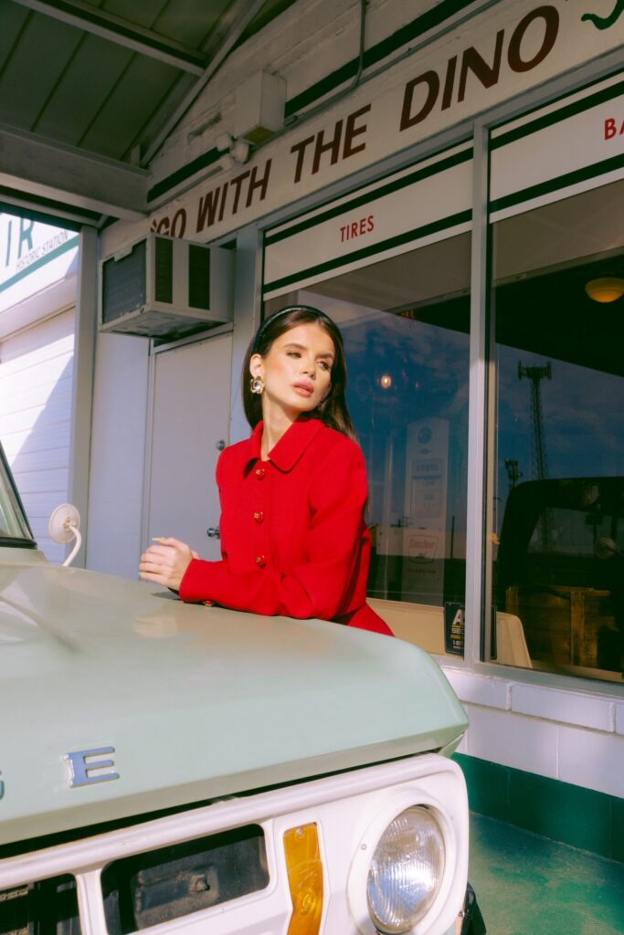
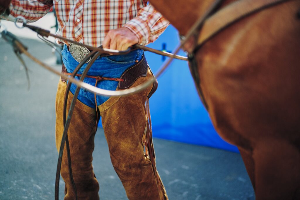
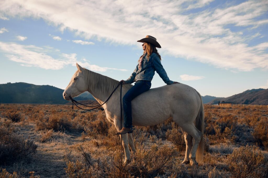
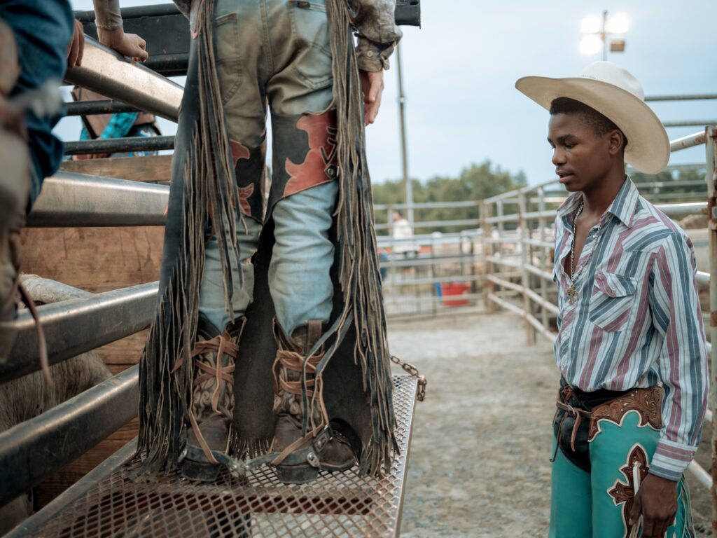
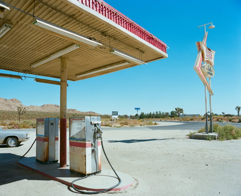
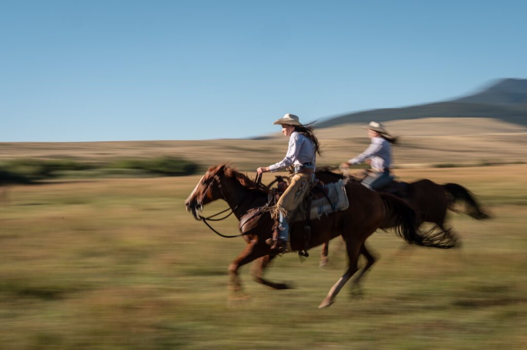
From cowboys and ranchers to everyday people in small rural towns, from wide-open roads to weathered storefronts, this style captures a part of American culture that feels tactile and grounded.
It has a sense of place. It has character. Most importantly, it has a point of view.
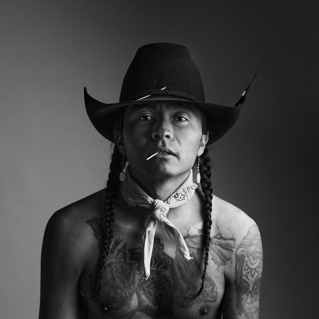
But the strongest use of Americana imagery isn’t about romanticizing the West. It’s not about turning rural life into a polished fantasy or leaning on the expected clichés. The real opportunity is in showing it honestly—the grit, the stillness, the beauty, the labor, the contradictions, and the people.
Authenticity Is the Real Power
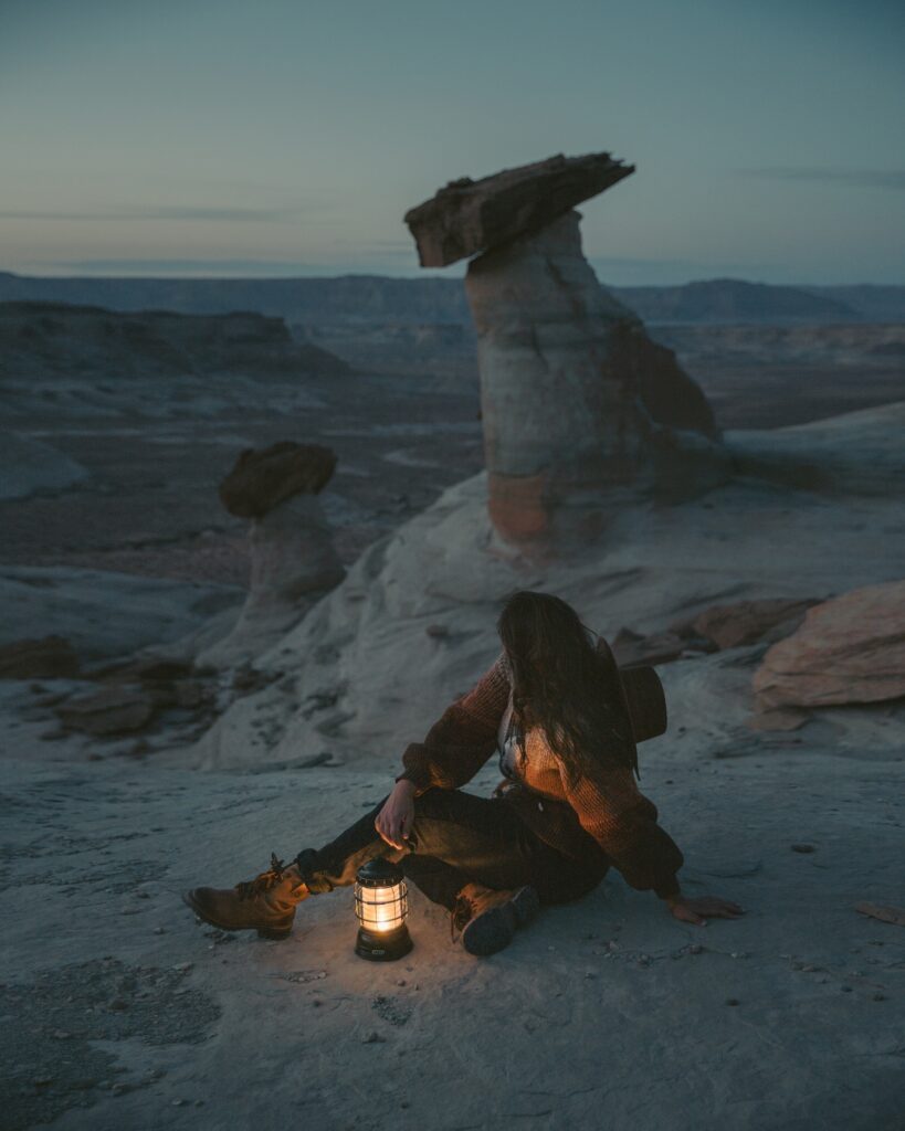
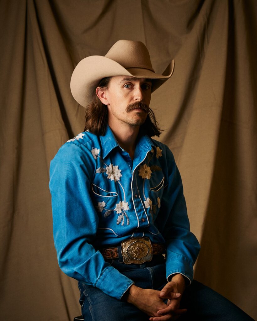
The best Americana imagery feels observed, a snapshot of a lived-in moment.
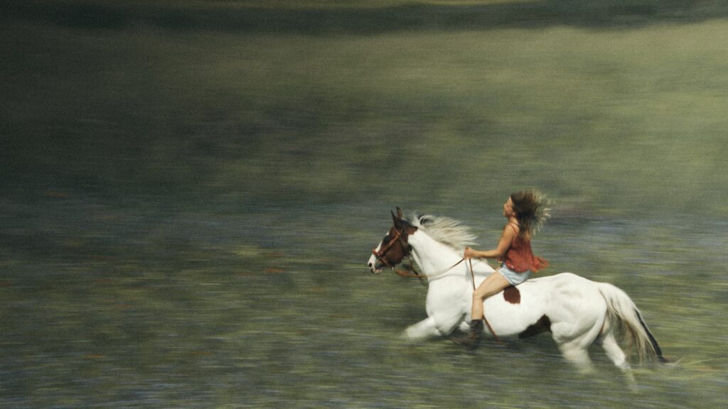
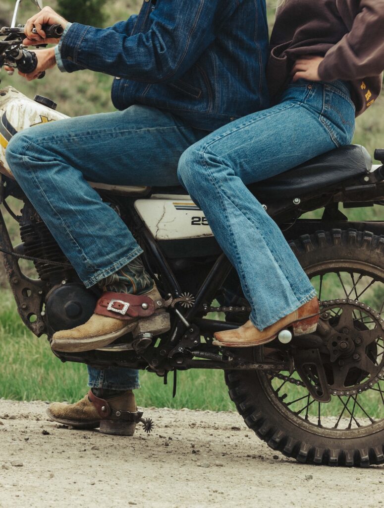
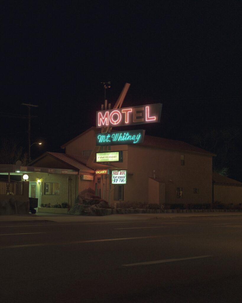
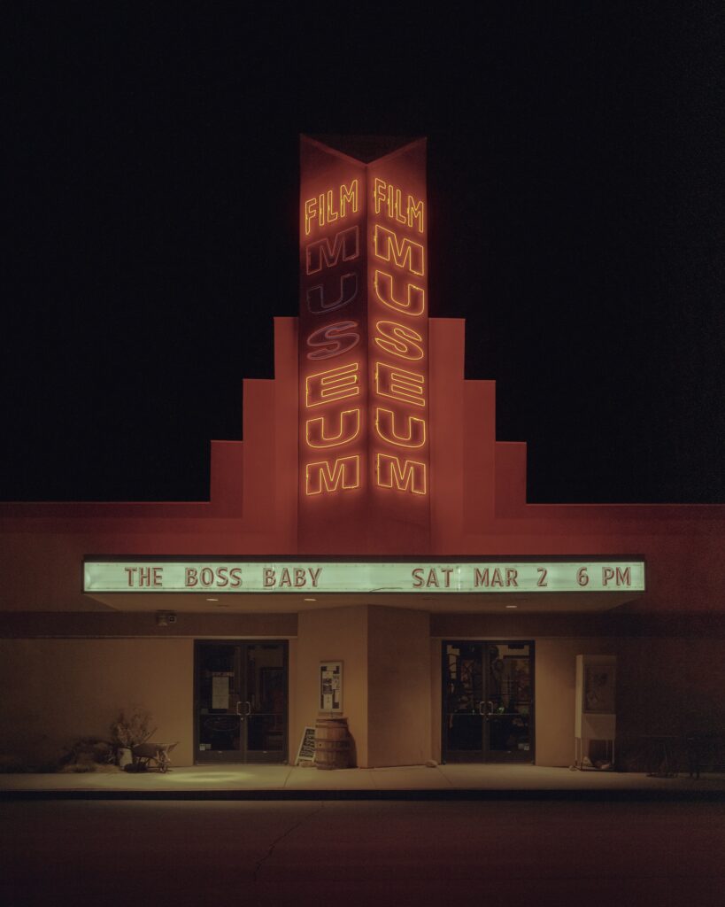
A quiet portrait can feel just as powerful as a horse galloping at full speed. A faded sign on the side of a building can tell as much of a story as a sweeping landscape. A pair of worn boots, a dusty truck, or a sunlit kitchen can hold narrative weight because these details feel earned.
That honesty is what gives the imagery its power. It doesn’t ask the audience to buy into a fantasy. It invites them into a real environment shaped by time, work, and culture.
For designers, that authenticity is gold. It builds an immediate emotional connection and gives the work a visual foundation with real character. Against the polish of hyper-clean campaigns and generic lifestyle imagery, Americana offers something harder to fake: a world that feels genuinely lived in.
RELATED READS: Flash On: The Raw, Authentic Visual Style That’s Reshaping Photography
A Tasteful Approach to Visual Storytelling
Using Americana imagery well requires taste. The difference between a campaign that feels iconic and one that feels costume-y comes down to curation.
A cowboy hat in the frame won’t carry the concept on its own. The image needs restraint, intention, and a strong editorial eye. The right photo should feel like it belongs to a larger story. It should make the viewer curious about what happened before and after the frame.
Americana becomes most powerful when it works as a storytelling device. The imagery brings a sense of place, while the curation gives it meaning.
The ongoing success of Western dramas and films rooted in this culture shows that audiences are drawn to this visual language. For brands and designers, the opportunity is to understand why it’s working, then push it into new visual territory.
That’s the tastemaker move: recognize the cultural pull, then interpret it with enough restraint and originality that it feels fresh.
RELATED READS: The Design Trend Report | 2026
Texture Creates a Distinct Visual Identity
Americana imagery brings colors, surfaces, and character that are difficult to replicate in urban environments or overly polished campaigns.
Dusty neutrals, sun-washed reds, faded blues, denim, wood grain, open skies, leather, metal, and natural imperfections can instantly give a campaign a sense of place. These textures create a sensory quality that makes the work feel more grounded and memorable.
This kind of imagery adds friction in the best way. It gives the eye something to hold onto. It makes the work feel less manufactured and more emotionally present.
Don’t Let the Design Become Too Obvious
Just because the imagery evokes a Western aesthetic doesn’t mean the design has to follow suit.
Some of the strongest creative opportunities come from contrast. Brutalist layouts, rigid grids, oversized typography, and minimal color systems can create a striking tension against texture-packed Americana visuals. The imagery brings warmth. The design brings structure. Together, they create an identity that feels honest.
RELATED READS: The Case for Bolder Color in 2026: Why Cloud Dancer Misses the Mark
A campaign doesn’t have to dress itself in vintage type, rope textures, and sepia tones to communicate the West. It can be modern. It can be bold. It can be restrained. Americana gives designers the emotional foundation, while the design system can push the work somewhere more contemporary.
That contrast is where the magic is.
Why This Trend Has Staying Power
Ultimately, people connect with stories. And when an image can communicate history, place, emotion, and character in an instant, it gives your design a head start.
Americana imagery crafts a sense of place and perception, giving the audience something to feel before they even know exactly what they’re looking at.
That’s why this trend has staying power. It’s a way to bring authenticity, narrative weight, and human texture into work that needs to resonate.
The best use of Americana feels intentional. Specific. Real. It shows the West with enough honesty to respect the culture and enough taste to move the aesthetic forward.
Because when imagery feels real, people lean in. And when it’s curated with a true point of view, they remember it.
Download the 45-Page Stills Trend Report
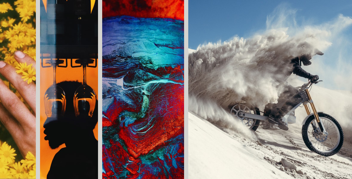
Design culture is changing fast. More detail. More color. More weirdness. More intention. These trends reward experimentation and give creators the freedom to try ideas that feel alive.
By entering your email into the field above, you are opting in to receive communications from Stills. You can unsubscribe at any time by clicking the ‘unsubscribe’ link at the bottom of our emails.
Explore Americana on Stills