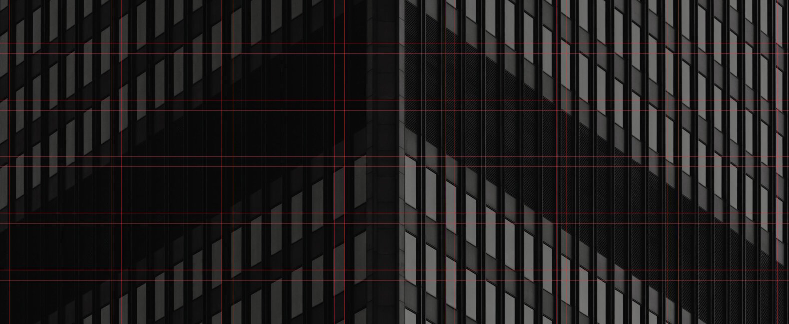
Grid systems are an effective tool to organize a well-balanced layout in both print and digital design spaces. With a proper grid system in place, information can be quickly understood due to creating an organizational structure. An intentional layout creates an even flow of a visual experience from page to page. Without it, text and images can lose their meaning and get overlooked due to not following a concise pattern.
Fundamentals of grid systems
Layout design is the practice of arranging various elements with one another. A great layout has specific visual points of interest that guide the viewer through the design. The easiest way to create a successful layout is by using a grid system. A grid system allows these layouts to have a structural foundation to follow throughout a website, advertisement, or magazine.
An effective use of grid systems can be found in a book cover design where the text, images, and negative space all work in harmony to draw a potential reader in. An organized layout here marks the vital information and then draws the viewer deeper in with more secondary elements that work to pique the interest enough to open the book.
Another example of how a grid system creates impact is through a magazine layout. There are usually competing elements that need to work together on a page. Each page differs from the next which is why it’s key to have an organized pattern of how text, page numbers, and images are consistently placed. This allows the reader to easily navigate through different types of content in the magazine.
Selecting the right grid
Various layouts and mediums can benefit from different grid systems. Depending on the project, you can choose a grid that anchors your content in the right way. The different grid types consist of manuscript, modular, column, and hierarchical.
Manuscript grid
Starting with the simplest grid, a manuscript system is contained with a large text box of typical page margins. The secondary border is a guide for headers, footnotes, and page numbers. This grid is most effectively used in books, professional documents, and long essays. These are typically not used for more complex and creative layouts.
Modular grid
If you need a multifaceted layout, a modular grid system is a beneficial option. This grid system contains columns and rows that make up modules or boxes on a page. These modules have gutters between them to create space from one piece of content to another. These types of layouts can be seen on our phone home screens and are often used in e-commerce, schedules, or charts.
Column grids
Our next grid system makes longer text easier to read. These are great layouts for newspapers, magazines, and websites. A column grid is a system that is set up with several columns ranging from 2 to 4. This system relies on vertical guides for text and images to be laid out consistently. These columns are usually the same size although you can create asymmetrical columns to add a unique visual interest.
Hierarchical grids
This grid system is most commonly used in website design as it organizes content in order of importance. A hierarchical system leaves room for the most creativity while remaining intentional about how the information is perceived. These grids are usually set up with customized proportions instead of a more predictable pattern. This is helpful to use when a layout requires a more unconventional approach.
What is grid flexibility?
With any design project, it’s important to know when and how to break the design rules. A designer can be flexible when it comes to a layout without breaking the integrity of the design. Adjusting an element outside of a set grid can add depth and diversity to a layout. This can be done by creating an obvious placement of a component outside the grid. This shows the viewer this was an intentional design choice instead of a mistake.
Grid flexibility should be kept limited to 1 or a few elements to still retain the structure of the layout. When breaking these design rules, it’s essential to still be mindful that text is legible, branding stays consistent, and photos are high-quality. Images are one of the most common elements that can be pushed outside the margin. If you are looking for exceptional images, Stills can be a perfect resource for your ideal layout design.

Responsive design and grid systems
When designing for different screen types, grid systems need to adapt to the changing dimensions. Overall when it comes to designing for mobile, the number of columns will change. Mostly, you will be limited to one column where the viewer can scroll through the content. The content must make sense when it is forced to be stacked on top of each other. A fluid grid system will help stay consistent with a layout. This allows the breakpoints to change the design to fit the desired screen size. It’s also important to take into account background images that bleed over and if the impact of that image remains in another screen size. Some images can work well in all screen sizes, and Stills has an extensive library to choose from.
Typography and grids
Typography always plays a key role in any graphic design project. It’s important to be intentional about how text is set up on a grid system to create an even flow. Since grids are about creating an organizational structure, getting exact placements for typography can make reading information easier especially when working in multi-page documents.
Alignment is a key element in how text can be set up on a grid system. Staying consistent in alignment on a grid will help the information flow through a layout. If you have a text-heavy design, a visual hierarchy can be created to guide the viewer through the information in a sequential manner.
It’s best to start your design project by laying out all your text on the side of your artboard space. From there, you can quickly access your content and start planning which text is most important. This will help you determine your text hierarchy. Next, you can set up a grid system that works best for your layout and place your text consistently throughout.
Here is text on an effective grid system on an e-commerce listing page. You can see the text is laid out concisely to create a hierarchical structure that allows you to easily flow through the content.
Invitations are another place you can see typography laid out on a grid system. Here you can see the headlines of the text are treated in a way to highlight the key information. The secondary text follows in a more subtle approach.
Tired of using bleak stock images?
Try Stills, a photo licensing platform for exceptional designers.
The New Standard in Photo Licensing
Using grids for visual hierarchy
Visual hierarchy and grid systems work together to oversee the position of text, images, and graphics in any layout. The visual hierarchy gives guidance to what information needs to be the focal point and what is secondary. It’s important to create a sequential system for how you want the viewer’s eye to flow through a layout.
Once you have established what content needs to be emphasized, it’s essential to understand the visual weight of each element. This can be achieved by size, negative space, and contrast. An effective layout achieves a smooth flow from all elements with each other.
Photos are also an effective way to give the viewer’s eye a break from a more text-heavy layout. It’s important to use photos that help communicate your message and give it the proper placement in your hierarchy, as they can oftentimes evoke more emotion than text so let it enhance your layout by becoming the focal point.

Grid systems in print design
Print design benefits greatly from a wide range of grid systems. Newspapers were some of the first print materials that relied heavily on exact layouts and grids. If you look at any newspaper today you will see a common 6-column grid that allows the reader to easily move through stories. There has not often been grid flexibility in these types of layouts. Today we use them more creatively in advertisements, books, and posters.
A grid system will look different depending on the project. A more exact grid system in print design is needed for a multi-page document so you can keep a more organized structure throughout. For one-page designs, you have more flexibility to create a grid that only needs to benefit that one-off design. For example, a poster design can benefit from a hierarchical grid and allow some space for breaking outside the margins.
Grid systems in digital design
Designing in a digital space comes with different opportunities and challenges. These days, a user is used to scrolling through content so a grid must align with that setup. Not only does a grid system create a visual hierarchy in a digital space but creates a more enjoyable user experience.
Website grids are used to guide a viewer through its pages and eventually convert into either sales or subscribers. A clear organizational flow creates seamless harmony through the flow of content. Grid systems can have some variety here to create more visual interest. It is important to keep the outside structure of the grid consistent from page to page. This means keeping a constant page width but changing up what happens within those margins.
Grids come in many shapes and sizes and can be altered to fit your exact project needs. It may have been one of the first techniques you learned as a new designer but can be revisited to create more dynamic designs. Now that you have an understanding of different types of grid systems, combine various ones that work for your layout. In graphic design, it’s important to break the rules when it makes sense to do so. Think of grids as a set of patterns, rather than restrictions placed upon your design. A great layout has the power to improve a visual experience, and readability, and boost conversions.
The cover image via GS & Co
