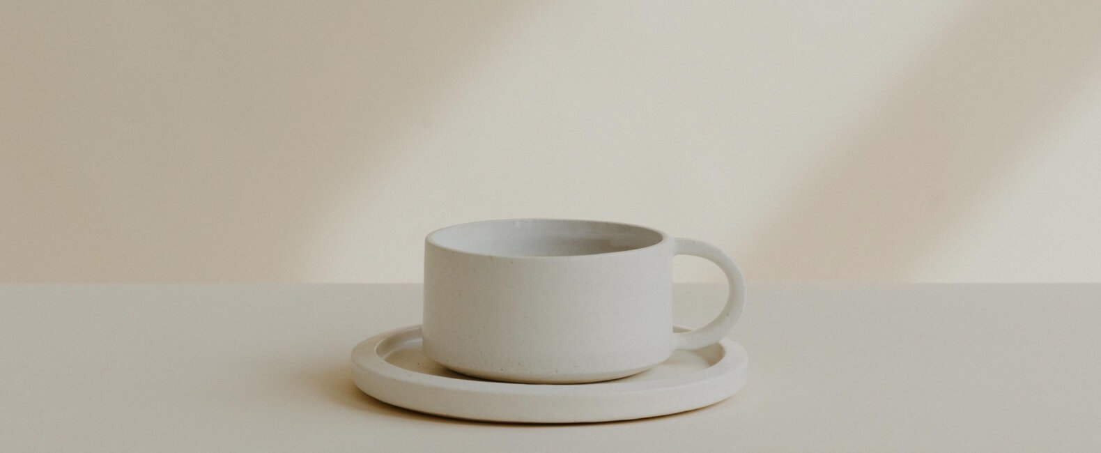
Less has always been more when it comes to graphic design and advertising. Minimalism is a modern design principle that uses simplicity to create clear and concise designs. We see its influence in art, interiors, graphics, and web design.Since minimalist design is an evergreen design concept, it’s important to understand how to master this art form.
Development of Minimalism
Minimalism rose in prominence during the 1960s and ‘70s, but the first emergence of minimalist art was from Frank Stella, who exhibited Black Paintings in 1959 at New York’s Museum of Modern Art. Since then, this design aesthetic has influenced artists all over the world.
Minimalism quickly influenced print and graphic design, as the reduction of extra clutter allowed designers to construct more clear and concise messaging. When the internet launched, website design quickly favored minimalism. It was all about presenting web content in a simplistic way over a more maximalist, busy approach. Minimalism in print, graphic, and web design included flat elements, reserved color palettes, and intentional use of negative space.
Minimalism in Graphic Design
Graphic design is all about intentionality. It’s an art form that requires a simple but more meaningful approach. In the digital realm, it forces you to use only essential elements to get effective messaging across quickly. Using fewer elements lets the designer direct the viewer’s attention to the main idea. This is why graphic design, especially in advertising, has always favored this principle over maximalism.
Minimalism in Advertising and Marketing
In a busy world, society craves more space and less noise. Marketers now need to find new ways to stand out while embracing simplicity in their visuals and messaging. Audiences are more drawn to advertisements with limited layouts, toned-down color palettes, and intentional use of negative space. This approach to advertising has been proven to grab audiences’ attention faster and for longer. A great example of this is Google’s branding and interface which remains clean and minimal, which makes it easier to use and interact with.
5 Key Minimalist Design Concepts
If you’re ready to start implementing minimalism in your design projects, the following five minimalist design concepts will help. You can experiment with these different ideas and put your own creative spin on them to fit your exact needs.

1. Simplicity and Reduction
When finishing a design, it’s essential to ask yourself what can be removed. This puts you in the mindset of only using what’s necessary. Admittedly, it’s easier said than done, but the effort is worth it. Because when you keep only the most important elements in a design, you remove all the possible distractions that might prevent your message from getting across. This concept can also be applied when choosing images to add to your design. Working with more minimalist imagery can reduce the visual clutter and keep your messaging clear and concise.

2. Emphasis on Form and Function
Removing distractions from a design allows you to prioritize form and function. This is especially important when it comes to building a brand, as you want design with functionality as the driving force. When elements are added for function over design purposes, you can create a strong visual experience for the viewer.
3. Negative Space and Visual Balance
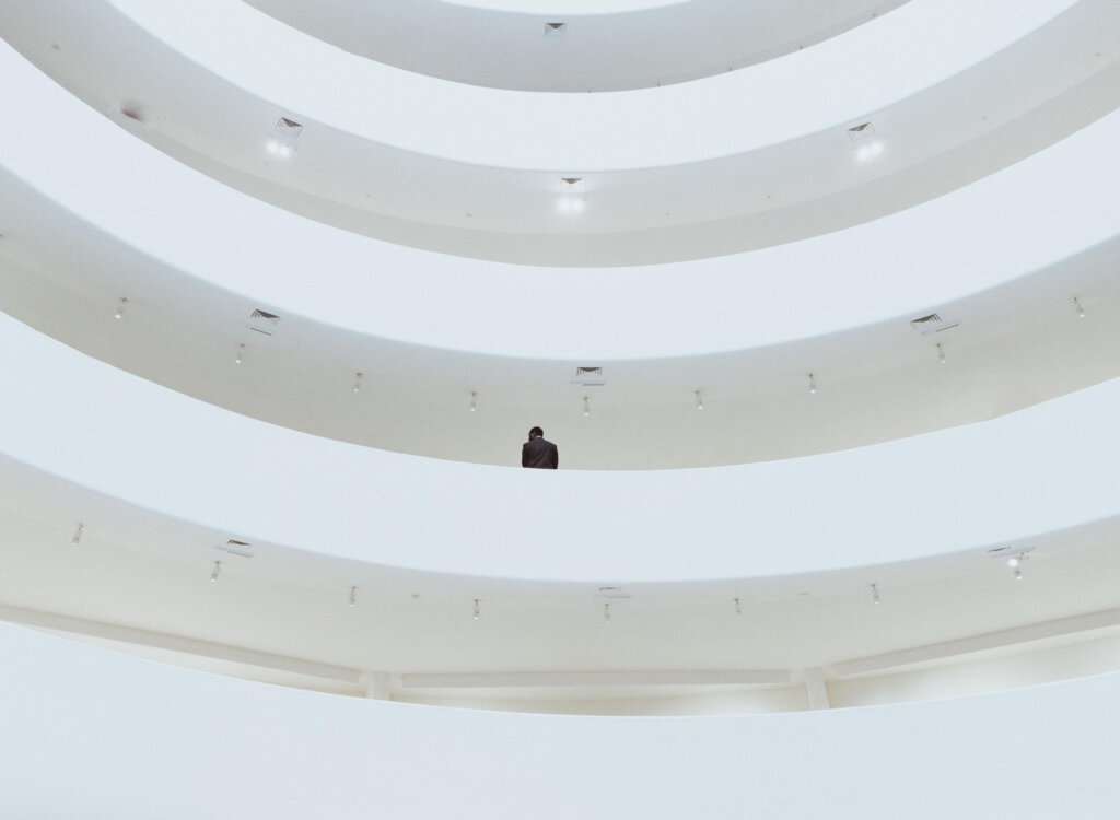
Minimalism is all about integrating the right amount of negative space to visually balance out the design. Negative space is the empty area surrounding any design element, like your logo, text, and image. You can use an effective amount of negative space to draw a viewer’s eye to the exact element that is intended. You can visually balance a minimalist design by creating strong contrast, increasing the size, or adding more visual weight to the main element. This will help you lead the viewer’s eye to the right place. Minimalist photography can be a great asset when paired with text to create an effective visual balance.
4. Monochromatic Colors and Contrast
Color is another avenue of expression, and restricting a color palette helps make designs minimal. If you want to limit your color palette to only two colors, be sure to choose something that can work in a strong contrast with one another. This will give you more versatility in your design while keeping it minimal. This is where a color wheel can be a valuable resource for choosing compatible colors.
5. Geometric Forms and Shapes
Geometric shapes are an effective way to add design elements without overdoing it. These can be kept flat for a more minimalist look, and they’re a smart choice when looking for a way to highlight different portions of text. Of course, in keeping with minimalist ideals, try to limit the number of geometric shapes you use.

Minimalistic Graphic Design
Reducing the amount of visual clutter in your brand’s graphic design can maximize your brand’s overall impact. Here are five examples to inspire your next graphic design project.
Modern Minimalist Logos
Minimal logos can be a challenge; they look easy to design, but they can take a lot of time to get right. They don’t rely on extra elements, so everything needs to have a purpose here. Even if a brand doesn’t adopt a minimalist design aesthetic, a simplistic approach is favorable when it comes to logos. Brands want their logo to be instantly recognizable, which can be achieved by choosing simple typography, utilizing space wisely, and sticking to uncomplicated shapes and icons.
Visual Simplicity and Branding
When it comes to branding, simplicity wins. Simplifying a brand design allows content and important messaging to speak for themselves. It also makes it easier for the audience to digest the content because the branding isn’t distracting. Visual simplicity is often more memorable, and branding is all about using design to make a lasting impact.
You can visually simplify your brand by limiting your color palette to fewer than three colors and choosing strong modern fonts. It’s also key to combine this with a minimal logo design so everything flows together cohesively.
Typography and Layout
Typography and layout are two of the most important elements of any design. Typography is fundamental to getting a message across, and layout is the foundation design must follow. These both drive the functionality of an effective design.
In a minimalistic design approach, it’s important to choose legible, clean fonts. Opt for sans serif styles over more traditional serif typefaces. Layouts should be less complicated and kept intentionally simple. This means a balanced and aligned layout with only the bare necessities.
Visual Hierarchy
When it comes to minimalist design, keeping a balanced visual hierarchy is key. Since minimalism is all about organization, this is where you can create a system that allows for more structure. Determine which elements need to be emphasized by creating a ranking system. From there, you can determine what necessary elements need to be sized, colored, or arranged to create a hierarchy. This is where your creativity can shine, because there is no set system to getting this exactly right. Play around and see what works best for your unique design needs.
Minimalist Art in Advertising
Minimalist art is a major fixture in successful advertising campaigns of the last decade. Brands use clever, subtle ways to make their advertisements shine, like making the concept straight to the point, with their messaging and CTA as the focus. This helps the viewer to not feel bombarded by a brand’s marketing efforts and creates a better storytelling experience through a direct approach.
Tired of using bleak stock images?
Try Stills, a photo licensing platform for exceptional designers.
The New Standard in Photo Licensing
Design Process
Creating a minimalist ad campaign is all about functionality. It’s important to put purpose over aesthetics. Therefore, start with a problem and highlight how your brand can solve it. Brainstorm different ideas on how you can bring this design to life. Refine your design process with the idea that provides the most straightforward approach to your advertisement. Keep narrowing your concept until it’s reached the ideal simplicity to move forward with a minimal advertisement.
What to Consider
It’s essential to consider and test how an audience will respond to a minimal ad campaign or branding. Although minimalism seems like an easy effort, there’s a lot of behind-the-scenes work to refine it. Keep in mind that minimal art in advertisements should focus on one simple message instead of several features or concepts.
Successful Example
Here you can see how the stain on a white shirt creates contrast while surrounded by a large amount of negative space. It forces the viewer’s attention straight to the problem. The brand recognition is secondary but cleverly placed.
Get Inspired By Minimalist Art
In order to fully understand minimalist philosophy, it’s important to be inspired by its origin in art. Since minimalism first emerged in the fine art world, a number of artists—Robert Morris, Dan Flavin, and Carl Andre, to name a few— played a role in its growth.
Influence on Modern Minimalist Design
All of these artists paved the way for minimalist design today. With their use of negative space, limited color schemes, and simplistic elements, we find these concepts repeated throughout minimalism in our modern age.
Exploring Minimalism in Different Mediums
Minimalism can take on various forms when it comes to different mediums. Here are some in-action examples of how it takes shape through four separate formats.
Web Design
Minimalism is popular in web design, as viewers are attracted to more easy-to-use interfaces. This can be done by prioritizing user experience over aesthetics, which allows your website traffic to focus on the important aspects of your site instead of busy distractions. Navigation should be designed to create a seamless online experience without any detours.
Print Design
If you are striving for a minimal design in print materials, a simple layout is key. Intentional negative space is one of the most common ways to achieve this. You don’t have the extra space to add unnecessary design details in a print format so it can work in your favor here. Find straightforward ways to organize text and images and play around with their visual hierarchy. Selecting photos with negative space can be useful in print design where the layout allows space to be paired intentionally with text.
Motion Graphics and Animation
This medium is more minimal, as it embraces the limitations of the 2D world. Even though there have been major advancements in motion graphics and animation, there is a favorable style of simplicity. When fewer details are included in an animation, it leaves a more creative interpretation for the viewer. This is a fun way to play around with minimal visual storytelling.
Experiential Design
Our environments have a major impact on the positive or negative emotions we feel. Experiential design is another medium where minimalist design can be expressed. This can create a multi-disciplinary experience for the viewer that can create desired feelings of comfort, excitement, or trust. Whether this is a public art installation or a corporate brand event, minimal design has the power to engage and inspire the audience.
Signal vs. Noise
Minimalism is here to stay, whether that’s in art, design, or advertising. As our world is bombarded with more noise and distractions, whether consciously or subconsciously, we crave more minimalism in our daily lives. If you want to reach the right audience in this modern and busy age, it’s essential to adapt to this ever-evolving design principle. If you’re looking for photos that can enhance your designs, search for minimalist photos in our catalog.
License the cover image via Gene Yoon.
