Can typography evoke emotion?
Jessica Walsh and her team at &Walsh think so.
The New York-based creative agency’s new foundry, Type of Feeling, is proof.
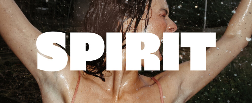
Featuring fonts like Joyful Jubel and Serene Serein, the exciting new foundry includes a unique collection of fonts, each built around its own sentiment and mood.
“We aimed to inspire designers to look at the typeface for their own projects,” Walsh says.
The concept began as the studio revisited some custom typography left over from previous projects, sparking inspiration for the new, feelings-forward endeavor.
She and her team then began to reverse-engineer fonts around a wide berth of sentiments, from joy to longing.
“Our ‘musts’ for every typeface were distinction, timelessness, and emotion,” Walsh explains. “Our team explored expressive feelings that take you to a different place. Some started with emotion, and then we designed and built the typeface around that.”
Read our exclusive interview to hear more from Walsh on the agency’s new feelings-forward foundry and why the right imagery was necessary to tell each typeface’s story.
Stills: What inspired the name “Type of Feeling?” And how does it reflect your typography approach?
Jessica Walsh: Type of Feeling communicates exactly what we set out to do: create typefaces inspired by different types of feelings or emotions.
Our team explored expressive feelings that take you to a different place.
Take Jubel, for example; it expresses joy and celebration.
The thick strokes and lively curves exude excitement, and the “e” almost smiles at you, reflecting the jubilant mood and celebrative feeling of the word.
Walk us through how you conceptualized all the new typefaces from Type of Feeling. What did the initial design stages look like?
It was different for each typeface. Some started with emotion, and then we designed and built the typeface around that.
For others, we started with a type-design style we really wanted to see in the world.
We then named it based on the emotion we felt it best represented.
Our “musts” for every typeface were distinction, timelessness, and emotion.
“Typography, colors, iconography, photography: These are all elements that can work together to bring a brand’s strategy and key attributes to life.” –Jessica Walsh
How do you envision your typefaces being used by designers to evoke specific emotions or moods?
We spent a lot of time imagining the worlds around each typeface and how they came to life.
Onsra, for example, is the bittersweet feeling of longing for someone or something you know cannot return.
We tried to give these feelings an identity by building them directly into different typeface elements.
The balance of normal-width and double-wide letters, together with the exaggerated tail of the Q, all capture this sense of reaching and breathing slowly in and out.
We aimed to inspire designers to look at the typeface for their own projects.
And the fun part is seeing all the ways people use the type we never even imagined.
How does your team balance aesthetics and functionality in type design?
Good design is functional, but it is all within reason. Like my creative work, I believe rules can be broken when they serve a clear purpose.
In fact, we’re about to release a typeface in the coming weeks with a special character set that’s really fun and breaks basic typography rules.
In its regular state, it can serve the function of a normal serif. It’s through playing with range like this in our typeface styles that we balance aesthetics and function.
How did the team approach selecting the right images for the Type of Feeling website, digital content, and marketing plans?
We aimed to reinforce each feeling idea through the mockups we showed each typeface.
Ssonder, for example, is drawn from the feeling and realization that each person you see, each person you pass, and each person that exists has their own complex and distinct life. It’s like a gossamer web of experiences and memories.
So for this collection of website and digital images, we showcased the typeface on candles, matches, and books to help establish this realization’s unique feeling and complexity.
Each typeface has its own world of unique characters, ligatures, mockups, and photography that tell the typeface’s story.
What role does typography play in establishing a brand’s visual identity?
When working with brands to develop their visual identity, it’s crucial to understand what we want people to feel when they come in contact with the brand. And we believe a brand’s typeface is a tool for communicating those attributes.
Our work with Plenty is an excellent example of this.
So many brands in the produce space make their greens and produce look just edible with fairly neutral palettes and indistinct branding elements.
The question we asked ourselves is: why shouldn’t greens and produce look as delicious as hamburgers and fries?
So we set out to create custom typography for Plenty that made you desire to eat produce.
Our working name for the font file was “Tasty Type” because the brief to the team was a typeface you actually wanted to eat.
Instead of the type indicating “healthy,” we said, “What about feeling ‘hungry’?”
This type became the central element of the branding and allowed Plenty to stand off the shelf from other greens and produce brands.
“Find what you can bring to the table in type or photo that no one else can.” –Jessica Walsh
How can typography and photography create a brand or enhance a design?
Typography, colors, iconography, photography—these are all elements within a brand that can work together to bring a brand’s strategy and key attributes to life.
Sometimes, photography can hit on an attribute in a stronger way than type can and vice versa.
We look at them as tools and lean on them in different ways to bring a brand’s attributes to life within a brand system.
What advice would you give designers on integrating typography and photography in branding?
My advice is the same for anyone joining the creative industry:
Passion, curiosity, and persistence are the most important ingredients.
You must experiment, try things, and create a lot of bad work before you make something good.
Creativity is not always easy, and it’s not all fun and games. Don’t let hard times or negative thoughts kill your passion or hunger. Use them as fuel.
So take the time to research, understand the landscape of what’s out there, and find what you can bring to the table in type or photo that no one else can.
Read more about &Walsh’s new foundry at Type of Feeling.
Looking for more expert insight from &Walsh? Read Jessica Walsh’s go-to process for seamless photo shoots and explore the agency’s exclusive collection of imagery available for licensing on Stills.
