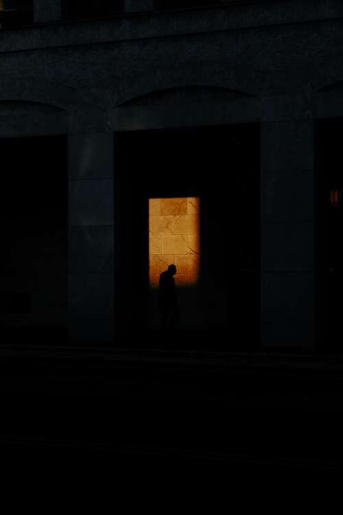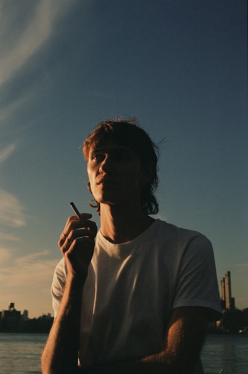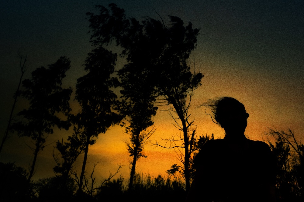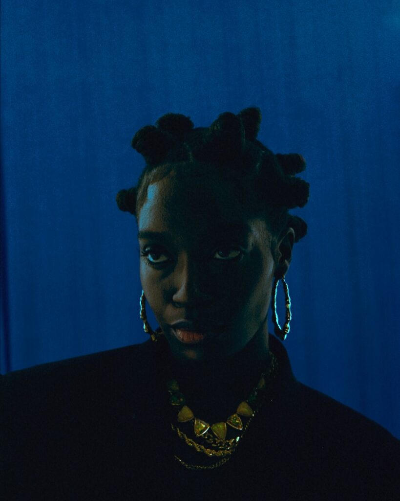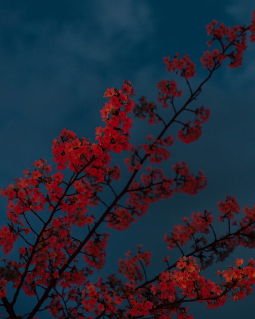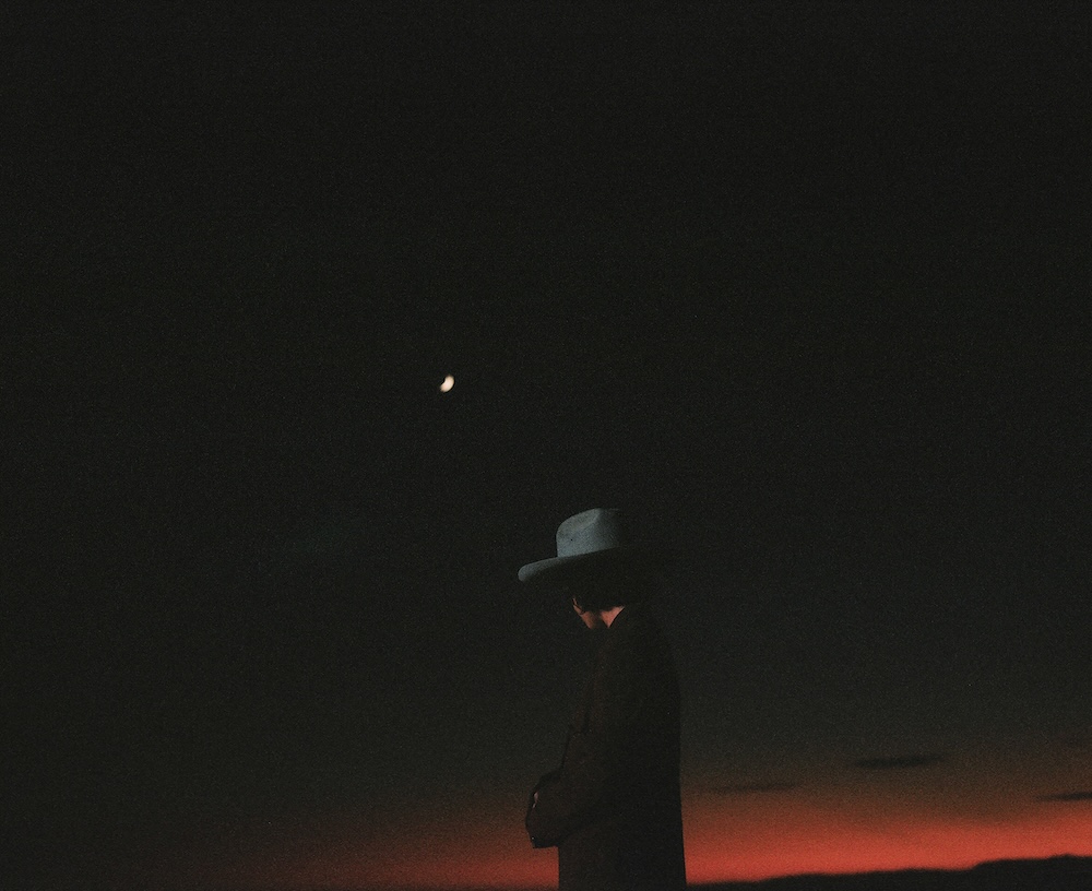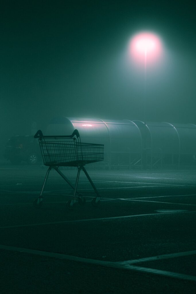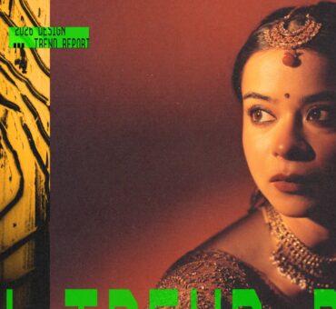
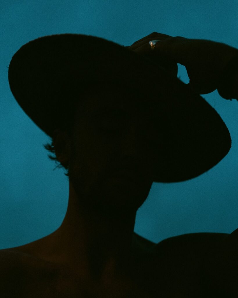
With feeds that are flooded with bright, overexposed visuals, dark imagery and low-light photography help campaigns stand boldly apart.
This aesthetic—where deep shadows, minimal light sources, and muted tones dominate—has found a powerful role in design. It evokes complexity, emotion, and intrigue, while amplifying visual impact when paired with clean, bold typography.
Drawing from cinematic inspiration and rooted in storytelling, low-light imagery allows designers to play with mystery, scale, and atmosphere.
And fashion brands in particular are dialing into this look, using it to craft scattered glimpses, textured darkness, and moments that linger in your mind.
RELATED READS: The Photography in Design Trend Report
Let’s break down 3 standout campaigns that nail this approach.
1. Fear of God ESSENTIALS Spring 2023 Collection
Shot with a muted, moody palette and minimal lighting, this campaign leans heavily into shadows and natural texture. The photos draw from ballet and yoga-inspired poses—elongated limbs, soft curves—paired with dim, ambient light that sculpts rather than floods.
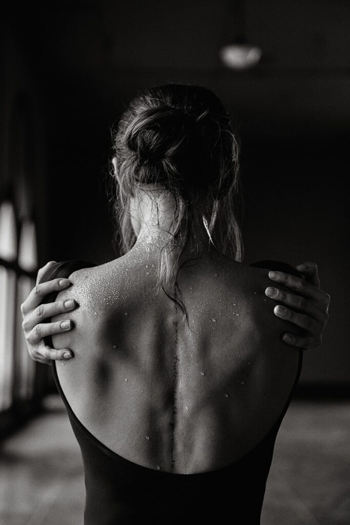
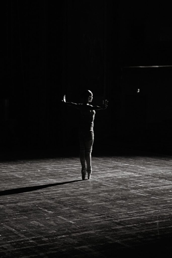
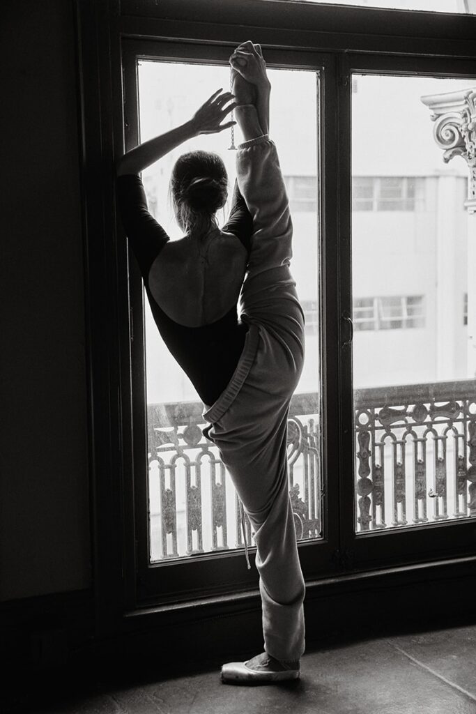
The absence of brightness emphasizes the movement and form of the clothes, reinforcing Jerry Lorenzo’s vision of a “modern wardrobe” designed for motion, not just aesthetics.
It’s softness meets shadow in the best way.
RELATED READS: Leta Sobierajski on Creative Influence and Collaboration
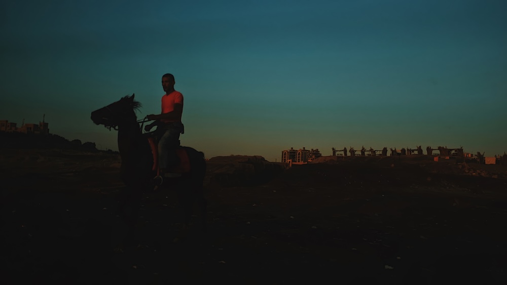
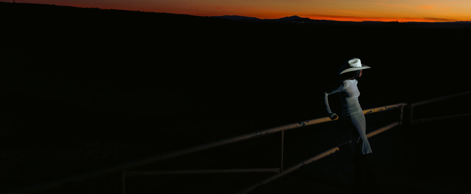
2. Zvelle’s “Ray’s Arena”
In Zvelle’s “Ray Arena” campaign, low-light photography transforms a riding arena into a stage for resilience and refinement.


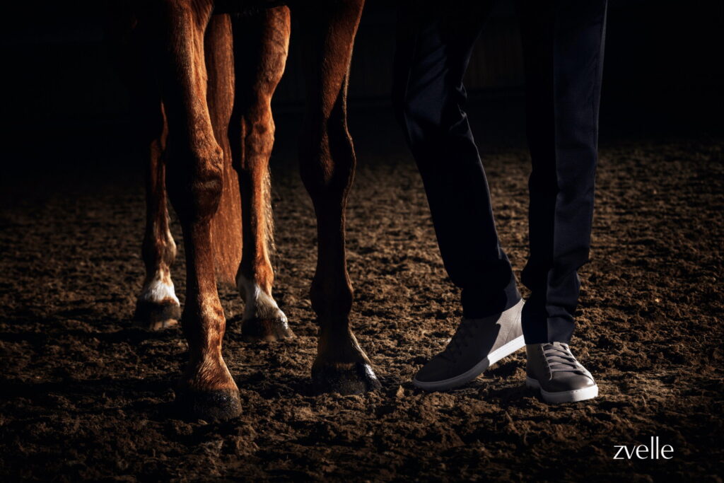
Using shafts of ambient light and rich shadows, the imagery feels cinematic and grounded—echoing the grit of Roosevelt’s “Man in the Arena” while spotlighting the elegance of the Ray sneaker.
Paradoxically, the darkness doesn’t hide the subject; rather, it reveals character, control, and quiet confidence.
RELATED READS: Designer Q&A: Pushing Creative Boundaries with Jessica Walsh
3. Prada’s Fall Menswear 1997
Though it dropped nearly three decades ago, Prada’s FW 1997 menswear campaign—shot by Glen Luchford and starring a young Norman Reedus—feels as relevant today as ever.
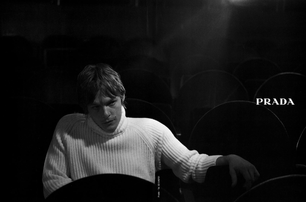
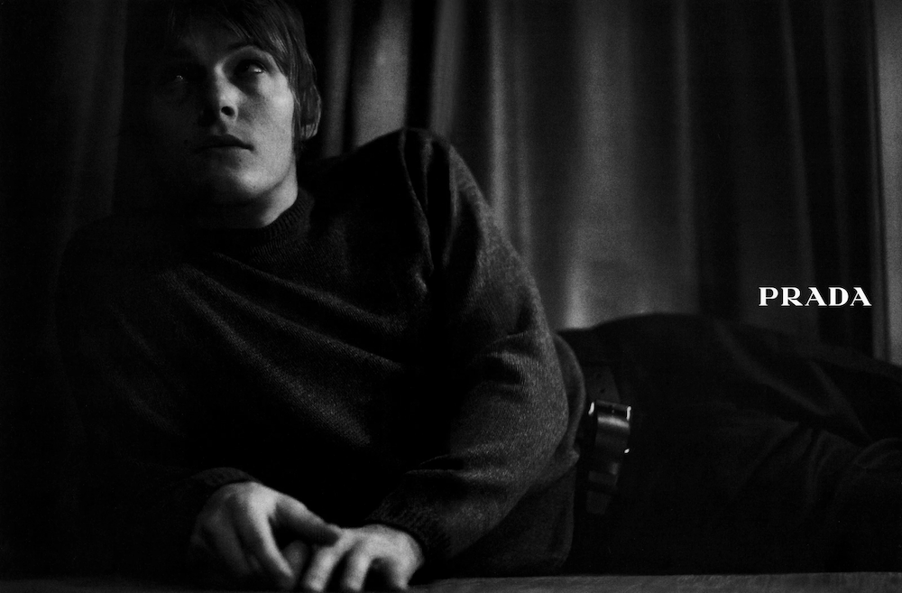
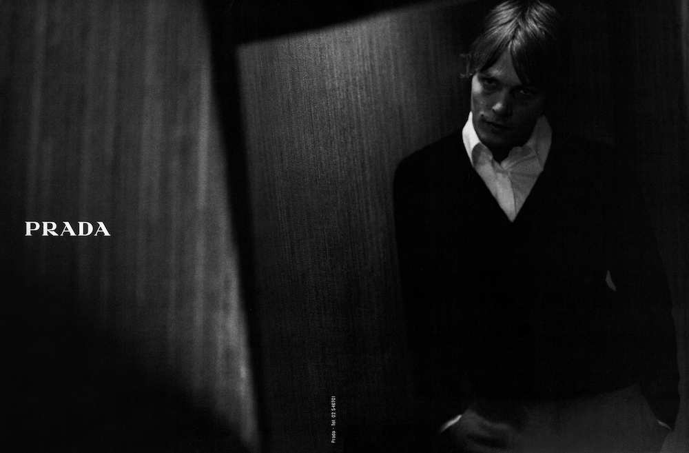
With its soft sculptural lighting, deep shadows, and minimal compositions, the campaign used low light not just to showcase clothing, but to capture mood. It’s proof that when lighting is intentional, darkness becomes a tool, not a limitation.
The aesthetics may be ’90s, but the principles of darkness are timeless.
RELATED READS: Beyond Aesthetics: How Joe Diver Balances Vision with Brand Legacy
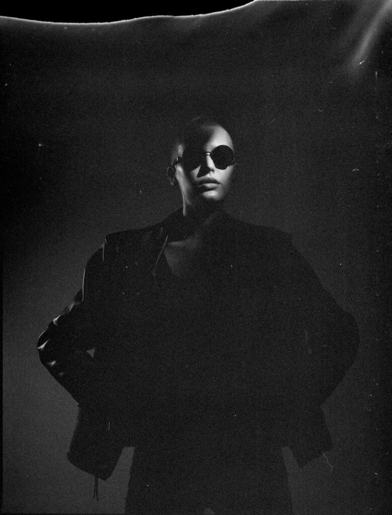
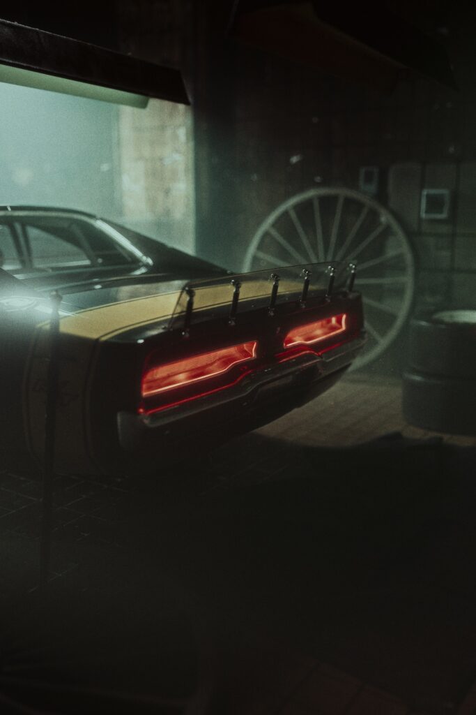
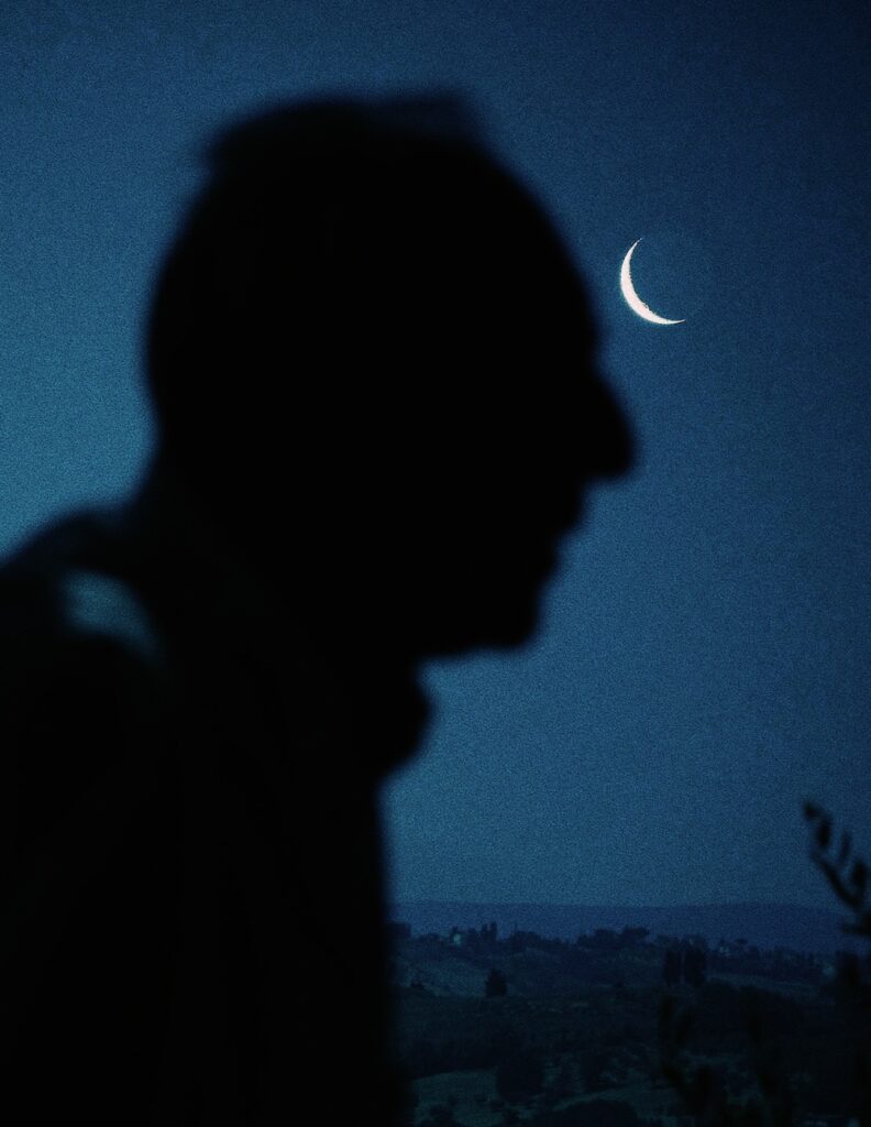
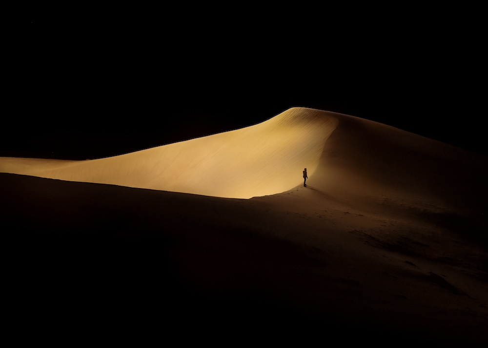
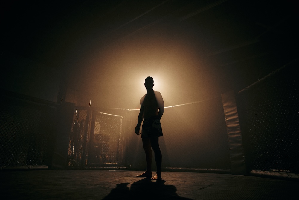
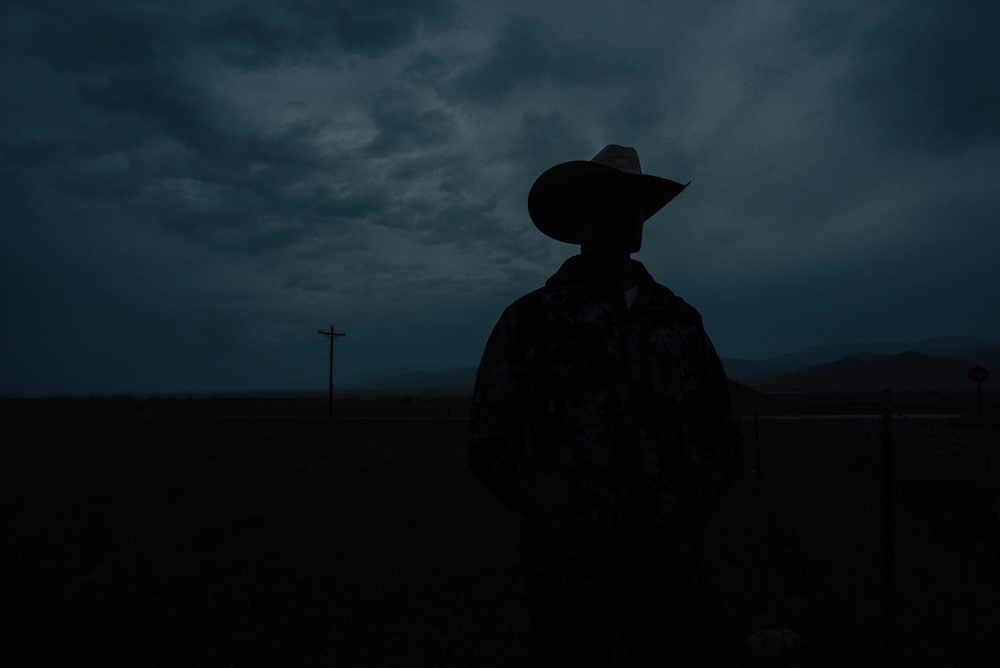
What Makes Dark Imagery So Effective
Directional, Minimal Lighting
Each campaign uses just one or two light sources—spotlights, neon glow, or ambient lamps—to create sculptural depth and selective focus.
High Contrast & Deep Shadows
The majority of the frame is deliberately left dark, allowing illuminated areas to command full attention.
Texture & Silhouette Focus
Low-light doesn’t highlight every detail—it surfaces shape and material, pulling the viewer in to explore.
Mystery & Emotional Weight
What’s hidden in the darkness feels more significant. The imagery evokes longing, mood, and narrative tension.
Typographic Harmony
Bold, clean type becomes key when paired with darkness. It contrasts sharply and amplifies messaging without competing for attention.
Bringing Dark Imagery into Your Design System
- Lighting: Use a single directional or ambient source—spotlight, neon, streetlight—avoid flat flash.
- Composition: Embrace negative space. Let shadows be part of your storytelling.
- Style: Isolate the subject with light. Let shapes emerge from darkness—perfect for texture, product, and portrait photography.
- Pairing: Match your visuals with crisp, minimalist typography to elevate your message.
- Mood: Choose low-light to evoke sophistication, intimacy, or cinematic suspense.
Explore Dark Imagery on Stills