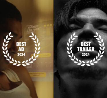
We spend a lot of time looking through our collection. A lot. In fact, most of our team has the footage nearly memorized. This makes it so much more amazing that the films you created for the Filmsupply Challenge made us completely forget we were seeing our content. You made it your own, and for that, we applaud you.
For those of you who are just now joining us, we asked people to create a 60-second (or less) edit, using our footage and music from Musicbed. The challenge was meant to be just that, a challenge—create something in a short amount of time that would blow our judges’ socks off. More than 2,500 brave souls took on this challenge, and we watched each and every one of them. Some were awesome. Some were wild. Some were both. We loved every second of it.
That wasn’t the hard part. That was the fun part.
We left the hard part for our incredible judges’ panel. Our 10 judges had the nearly impossible task of selecting winners in 7 different categories. They looked for originality, complete ideas, technique and most of all, the feeling that they were watching something completely new. Needless to say, there were plenty to decide upon, but they’ve made their decisions.
Because we definitely don’t have the space to include comments from all 10 judges, we’ll sum things up ourselves. Without further ado, here are the Filmsupply Challenge winners.
Best Spec Ad | ‘Landing it Right’ by Josh Allred
We have a soft spot for skateboards. There, we said it. And this one is great. It’s the essence of a commercial that’s heavy on vibe, short and sweet. It doesn’t say much, because it doesn’t need to—and that captured our attention. Each clip seems very intentionally placed, the sound design is spot-on and the slick graphic work at the end is the icing on the cake. It’s a great ad and we’re pumped the judges picked it. It’s almost rad enough to get us on a skateboard, except for we’d severely injure ourselves.
Best Title Sequence | ‘Mercy’ by Tyrone Deise
The judges had a lot of awesome title sequences to sort through, but this one had it all—a perfectly matched soundtrack and coloring that really set the tone for this show we wish existed. The VFX overlays are a perfect way to mix the cityscape with the human element of a hospital drama. And who can’t get enough of hospital dramas? We’re already having flashbacks of George Clooney in his scrub-wearing days.
Best Trailer | ‘Cure’ by Tyler Lambert
We have a specific rating scale for movie trailers, and Cure earns a coveted ‘hell yes I’d wait in line to see that’ rating. That about says it all. There’s a complete idea here, using so many different clips to tell a story. There’s subtle, but effective VFX hints. There’s even some sort of (spoiler alert) alien cameo at the very end. For those of us that like some trailers more than their respective movies—which is probably all of us—this one’s a keeper.
Best Concept | ‘More Perfect Union’ by Mary G. Ahlman
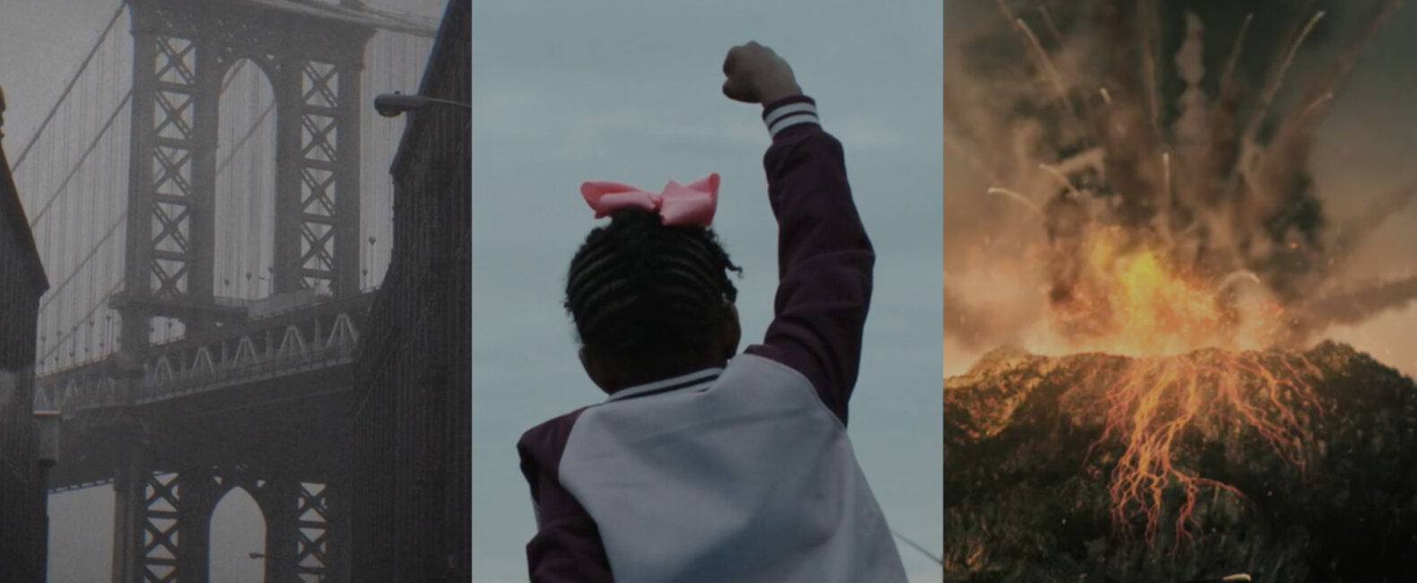
Talk about timely. Talk about good. This tearjerker is the epitome of a message that needs to be heard, now more than ever. In fact, it’s a miniseries we desperately want to be made (hope you’re listening, HBO). Beyond what it says, this trailer wisely uses a powerful VO from Robert Kennedy, which matches perfectly with the rhythm of the footage the editor used. It’s a good idea, and it’s executed to perfection. Seems like a recipe for Best Concept to us.
Best Color | ‘Sweetheart’ by Pete Ward
We have a lot of diverse footage that runs the gamut of color and tone. The fact that this endearing, retro-styled edit makes dozens of clips look like a cohesive, intriguing and artful title sequence is mindblowingly awesome to us. For those in the know, coloring is one of the most under appreciated niches of the film world. For those not in the know, this is a perfect example of how it’s done well.
Best Sound Design | ‘Imagine Heaven’ by Stephen Gray
A car wreck, a hospital, whitewater kayaking… space!? This submission was definitely ambitious in its sound design—a good example of taking a challenge and utterly nailing it. The sound is at it’s best complementary to the footage, but never distracting. Good sound design takes you there, and in the case of this trailer, it takes you just about everywhere.
Best VFX | ‘Sharkcano’ by Philip Bowser
What can we say about Sharkcano? It’s not Spielberg, but man we’ve watched this one a lot—more than we’d like to admit. Any trailer that’s ambitious enough to have a man jump out of a helicopter to sucker-punch a lava shark in mid air is alright in our book, and our judges felt the same way. We don’t know how the sharks got in the volcano in the first place, but does it really matter? That’s some badass VFX work.
There you have it! We laughed. We cried. We had an awesome time watching every single one of your submissions. A HUGE thanks to every single one of our judges for taking the time to review these edits. They took a lot of time and consideration reviewing each submission.
Another thanks goes out to our sponsors. They made this competition possible, with more than $100K in prize packages and giveaways to our lucky winners. We couldn’t have done it without them! If you’re one of our winners, head over to filmsupplychallenge.com to see all the swag you’re taking home. If you’re not one of our winners, better luck next year!
Congratulations to this year’s winners, and to everyone that entered a short. We hope you had as much fun making them as we did watching them.
