Chayse Irvin, CSC, is a renowned cinematographer whose CV spans commercials, short narratives, music videos, and feature films. He has lensed projects for music legends like Kendrick Lamar and Beyoncé — most recently her visual album, Lemonade, which Rolling Stone called visually “stunning.”
Here are a few of his frames.
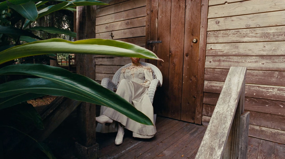
‘LEMONADE’ [03:08]
Chayse Irvin: This frame is from the Beyoncé film that came out this year, Lemonade. One thing you need to know in order to understand this frame is that Kahlil [Joseph, the director,] sees cinema more like jazz than anything else. It’s all just music for him. He refused to write a treatment for Lemonade, so there was no way for the production company to draft a budget, or for Beyoncé and her team to completely figure out what we were doing. Kahlil invited me to Louisiana two weeks prior to shooting, and we traveled around coming up with different themes and images. Point being: the whole piece was an improvisation, and this frame more than most.
There was a lot of drama on set on this particular day, for all the reasons I described above. There were extras everywhere, and not all of the crew understood the nature of the way Kahlil and I were working, which was we could be rolling at any instant, in any direction. I was getting very frustrated with crew members who kept walking into my frames — not purposely, of course, but because there was so much chaos. So I stormed off set and snuck into an area where nobody was shooting.
The woman in this frame was really interesting to me. She appeared very natural, and I wanted to build her character. I saw her as one of the leading characters, or figments, that we’d be able to use in the edit. These are the kinds of things I make up in my mind as we’re shooting, regardless of whether they turn out to be true. Anyway, this frame happened by pure luck. I was shooting with an Arricam LT with master primes, which is my own personal kit. Originally when I framed this, a sharp piece of sunlight was coming through the bush and projecting onto her body. But as I started rolling, the sun went away. So it’s a very different image than I intended it to be, but it’s more interesting to me that way.
I selected this frame because it’s an example of a particular theme I follow in all my work. I guess I’d call it “veiled erotica.” It’s something [Henri Cartier-]Bresson talked about as a photographer. He’d conceal portions of people’s faces or portions of the image to create a sense of mystery, an erotic sense of desire, or maybe a sense of interpretation. Even though there’s a bush over this woman’s eyes, you still know that she has eyes. Because you know she has eyes, there’s a bit of catharsis on the spectator. They project eyes, or what they understand as eyes, over the covered part of the image. While I’m shooting, I’m constantly trying to figure out how to conceal information.
In terms of focal length, I shot this on a 16mm Master Prime, which is probably my favorite lens. I think the aperture here is a little deeper of a stop than I normally go. But the deep focus in this frame became interesting. It has a depth to it because of the wide angle. The master prime has a subtle and beautiful distortion, which is usually a flaw that lens makers try to subtract out. The master primes don’t correct that, so they actually distort quite beautifully. I think that distortion brings some of the richness and depth. I also tried as best I could to keep both the woman and the leaf across her eyes in focus, so that it becomes an illusion of depth. As the shot meditates, you can study the frame in different ways. You can look at her face. You can look at the bush. You can look very deep into the background. That was all really important to me in this frame.
‘LOOMS’ [4:46]
CI: This location was quite horrific, to be honest with you. It’s a pigpen for piglets, and it smelled like one. It was disgusting and humid because all the heaters were on for the winter. Originally the location was lit with these compact fluorescents that were throwing light everywhere. We didn’t have access to film equipment because this was in the middle of Iowa. So I went to the local hardware store and saw they had these LED bulbs called, I believe, PAR30s. They’re parabolic reflective bulbs that are used as spotlights. I guess on farms they use them as motion-detection lights. So I replaced all the bulbs that you see in this frame with these spotlight bulbs. And I like how it ended up looking.
I also put a fluorescent light at the end of the hallway. I believe the brand is called Daylight Deluxe. It’s a bulb I adore. It’s a bluer green color temperature, rich and beautiful. But it’s not like a film color correct. It doesn’t have a full spectrum of color. It has a very low CRI. So it gives you this texture you can’t create with gels. Over the years I’ve grown into this habit of using commercially available light. Oftentimes I’ll take a bunch of Daylight Deluxe bulbs and place them in Kinos, rather than using the Kino bulbs. I’ve never been able to get the same color using gels. The problem is the Kino bulb has a high-quality CRI, and you’re never going to be able to change that.
So I used this fluorescent bulb at the end of the hallway, and I hung it there with zip ties. That’s a trick I’ve used for years. Zip ties and Velcro. It looks authentic on camera. You travel to these places, and you see the way people light their farms or workshops. They don’t have design in mind. It’s all functionality. Sometimes they hang a light by its own cord. I think it’s all beautiful. I’ve tried to take notes of those tiny, tiny details and re-create them as best as I can.
So that’s the lighting. The focal length, I believe, is 21mm Primo. I had a theme on this short film where I was always shooting imagery from behind a character on 30mm. Then anything in front, looking at his face, was on a 40mm. When the camera traveled in a kind of Godlike way, independent from a point of view, I’d use a 21. This image looks like a 21, so I probably broke my own rule for this particular shot.
The reason this frame is important to me is because we ended up shooting it several different ways ⎯ the actor walking forward, the actor walking backward, etc. Because he’s not an actual farm worker, it was difficult for him to find a way to throw the feed that felt natural for him. When we made this film, I had just come off a feature where the director used the repetition of a particular scene to create a sense of banality. I had a similar idea to use all the different takes we’d shot of this frame to give the character a sense of desperation through repetition. It became a real strength for the film, and it was constructed purely out of experimentation — not knowing the answer, not knowing the truth of it, just allowing the decisions we made on the day inform the edit and the story.
‘MEDEAS’ [1:11:12]
CI: Here’s a frame from a forgotten film I did with Andrea Palero called Medeas. It’s a really, really special film, and I’d encourage anyone to see it. This particular scene is a very intimate moment for the family. Catalina, who is deaf, and her children are all listening to music; and she’s feeling the vibrations of the music through the balloon. It’s probably my favorite moment in the film — my favorite image in the film — not only because Catalina is an amazing actress, but also because she taught me so much about cinematography and working with actors. But I’ll get to that in a bit.
One thing that’s great about this frame is the production design. I love the lines in the wallpaper. They add so much to the composition. And the mirror reflecting the back of her head — it’s a window into another perspective, another point of view. I love images that have different depths like that. Different windows. Different conduits where the spectator can travel to study the frame.
I think the most important thing to me in my cinematography is to create images that become hypnotic. Each frame has a weight and beauty, but it is also very minimal. I don’t exhaust lighting possibilities. I’m not trying to overexcite the viewer. I’m trying to make them vulnerable. This image is all of that in a basket for me.
I shot this with a Panavision G2, which is sometimes called a Gold II. It’s an older 35mm camera, and it’s two perf. Only a few cameras are two perf; normally they’re three perf. We shot with only 60,000 feet of film, which is very low. But we shot with 1,000-foot magazines, which, in two perf, give you 20 minutes of rolling, allowing us to shoot for long periods of time without cutting. We let shots breathe and mature within the frame, which I found very interesting.
The lens was a 40mm. I shot most of the film on 40mm. I make decisions like that because I want the film to feel simple, to feel like it’s coming from a considered perspective. I believe that filmmaking is, in large part, about point of view. Not the characters’ point of view ⎯ the filmmaker’s. The filmmaker has to have a point of view. As a movie lover, I don’t watch films to see a unique story. I go to see the point of view of the filmmaker. So when I’m making these choices about lenses and focal lengths and angles, I try to make all those decisions very carefully and considerately. I impose constrictions on my cinematography early on, so I don’t end up attacking the film from multiple points of view. There’s a singular perspective throughout. It can be a bit shocking for the people I’m working with, focus pullers or technicians. They’re like, “You have only two lenses for this entire movie? That’s crazy.” But I think it’s beautiful, actually. I really do.
In terms of lighting, I wanted this shot to feel very romantic. I lit the rest of the film mostly from the top. Especially the night interiors. I wanted the rest of the film to feel raw and realistic. For me, top light gives you that feel. I’ll put lights in different areas to make little pools if the actor decides to stand on a particular mark. But the top light is not going to shift. It’s always going to be where it is. The light is less sculpted. It’s more random. It’s whatever it wants to be and whatever the actor wants it to be. But for this particular scene with the balloon, I wanted to shift all of that and create a stark contrast from the rest of the film. So I lit it from the ground, and I bounced a light off muslin. I think it was a 12 foot by 12 foot light that was behind the couch, which gave it a little bit of shape because the couch was cutting the light a little bit. And that was pretty much it. Just a single source, which I find beautiful. It feels natural to me. And rich. I was saying before how I want to create hypnotic images, and contrast is super important in that. I try to create images that have a lot of contrast and a lot of depth to the lighting.
One important thing: When you soft light an image like this, you have to pay a lot of attention to the makeup on the actor’s face. I’ve struggled with some types of makeup taking away from the light and making it feel artificial or fake. In this particular shot, Catalina is wearing minimal makeup. Maybe none. The light glows off her skin and makes her complexion beautiful. I think it’s because of that natural look. She’s beautiful with nothing. I adored that.
I want to talk a little bit about what I learned from working with Catalina — from a cinematographer’s point of view. During the shoot we mostly got along well, but there came a point when there was some tension between us. We had failed on a scene a couple of days prior. We had to pull the plug on the whole day of shooting. I think part of me blamed Catalina for this. I was worried she wasn’t as committed as we were. I don’t know why. I guess I was paranoid. And because of that, some tension formed around us. It wasn’t until after I watched the completed film for the first time that I saw how unbelievably natural Catalina’s performance was. How subtle it was. I accidentally mistook that subtlety for disinterest or a lack of commitment, but her performance was so beautiful. I learned how naïve I was as a cinematographer, not being able to recognize that. But you can see it here in this frame.
